

from matplotlib import pyplot as plt
I use Python as part of my PhD work almost every day. On most of those days, I use plotting functions to visualise my data and results – either as a “quick and dirty” check that my code is behaving as I expect, or to create publication-standard figures.
There are many different options for plotting out there, but I personally prefer to use the matplotlib pyplot library. I’m always discovering new functions and methods that make my life easier and improve the quality of my plots, so I thought I’d share a few of my favourites here.
Before I get stuck into the tips, I wanted to explain how and why I make plots with the plt.subplots() method.
plt.subplots()
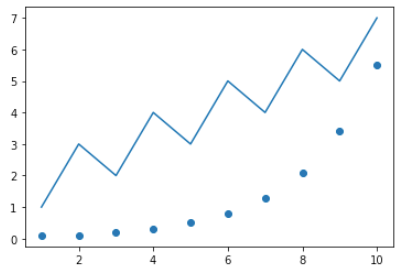
When I started out using pyplot, I used to make my plots like this:
plt.scatter(x, y)
plt.plot(a, b)
I eventually ran into lots of problems when it came to making plots with multiple panels and customising the appearance of my plot. I also noticed that my scripts for more complicated plots were becoming messy, difficult to follow and prone to breaking.
My solution: use the plt.subplots() function to access the object-oriented version of pyplot! Here is code that produces the same visual result as above, but unlike before, the subplots function creates a Figure and an Axes object:
fig, ax = plt.subplots()
ax.scatter(x, y)
ax.plot(a, b)
You start to see the true power of this method when you’re making figures with multiple panels and/or when you need more control over the appearance, e.g. adjusting the relative sizes of subplots, or aligning the axis labels. Here is a very basic example of a two-panel subplot where the x-axis is shared:
fig, axes = plt.subplots(2, 1, sharex='col')

# Remove vertical gap between panels
fig.subplots_adjust(hspace=0)

# Plot data
axes[0].plot(x, y)
axes[1].scatter(a, b)
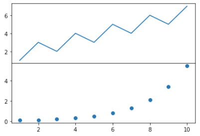
fig.align_labels()
A huge pet peeve of mine is seeing multi-panel plots with axis labels that don’t line up.
There is a very easy way to fix this if you’re using the plt.subplots() method: fig.align_ylabels() or fig.align_xlabels(). This is how it works:
fig, axes = plt.subplots(2, 1, sharex='col')

# Remove vertical gap between panels
fig.subplots_adjust(hspace=0)

# Plot data
axes[0].plot(x,y)
axes[1].scatter(a,b)

# Specify and align axis labels
axes[0].set(ylabel='y data')
axes[1].set(ylabel='b data')
fig.align_ylabels()
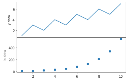
Doesn’t it look so much better?
axes.set()
I used to write 10s of lines of code to customise each aspect of my plots, e.g.
...
ax.set_xlim([-0.5, 50])
ax.set_ylim([10, 100])
ax.set_xlabel('x')
ax.set_ylabel('y')
...
Instead, it turns out you can stick all of these into a single line with axes.set(). I love how many lines this saves, and how much more readable my code has become – especially when I have multiple panels in a figure!
...
ax.set(xlim=[-0.5, 50], ylim=[10, 100], xlabel='x', ylabel='y')
...
rcparams.update()
If you ever find yourself wanting to customise the appearance of your plot (fonts, tick direction, axis line thickness, tick direction, etc.) you’ll probably want to use rcParams. You can manually update all sorts of properties – for a list of everything you can change and its current setting, type:
from matplotlib import rcParams

rcParams.get
There are a few different ways you can modify these properties. Here are three examples of how to change the x-tick direction from the default (outward) to inward.
rcParams.update({'xtick.direction': 'in'})
rcParams['xtick.direction'] = 'in'
plt.rc('xtick', direction='in')
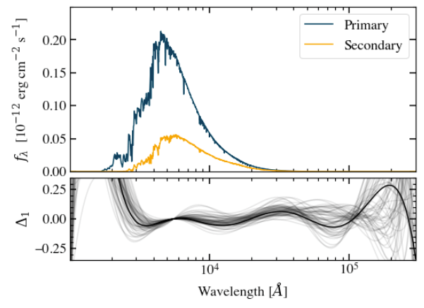
Here is a publication-standard plot that I made that uses custom rc settings:
Style sheets
If you, like me, find yourself wanting to re-use a certain style of plot in different scripts and projects, you might want to consider creating your own personal style sheet.
In essence, a style sheet contains custom rc settings which are automatically applied to all plots in your script if you initialise it with the line:
plt.style.use('your_style_sheet')
You can either use built-in style sheets, or make your own. I won’t go into the full details here, so I would recommend that you check out the matplotlib documentation on style sheets.
String formatting
This isn’t strictly a plotting tip, but is very useful nonetheless. These are two string formatting methods I use all the time:
1. Write LaTeX-style equations in Python strings.
axes.set(xlabel = r'$\lambda_{1}$ ($\AA$)')
2. Embed variables in a string in a compact and readable way.
c = 299792458

# Use this...
print(f'The speed of light in a vacuum is {c} m/s.')

# Rather than this...
print('The speed of light in a vacuum is {}'.format(c))
Anything else?
I hope you found some of these tips useful! I’d recommend following matplotlib on Twitter as they are very responsive, share cool plots from the community, and regularly post updates about features you might have missed.
Do you use matplotlib to make plots? What tips do you think I missed?

Leave a comment